
Colour plays a pivotal role in our homes. Not only can it make us feel differently about a space, it can change the way a room is used.
But knowing what colour you should choose and what shade can be hard. Knowing how to deal with how much light comes in to the room and so on. Interior designers, spend years learning this stuff, it’s no wonder it can be confusing.
Many of my interior design clients call me wanting to introduce colour into their homes but are not sure how. Having fallen into the trap of using grey or white everywhere it seem the idea of going bolder with a new colour scheme can be a little daunting. Knowing how bright is too bright and what shade or tone of a colour to use is understandably tricky for some to get their head around.
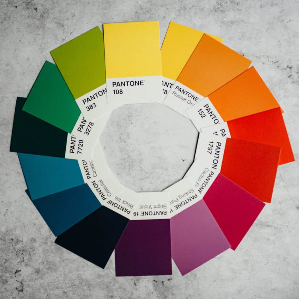
Designing a room – creating the right mood
This is not just about how an interiors colour scheme may make you feel, but it is also about the mood you want to create in a room. Do you want lively debate and colourful conversations in your dining room, or do you prefer a more sedate meal time? Is your study/work area for serious head-down, desk work or more blue sky, creative thinking? Do you want to create a nurturing retreat in your bedroom or a glam boudoir? This can be as much about the tone or shade of colour you use as much as anything. Still confused?
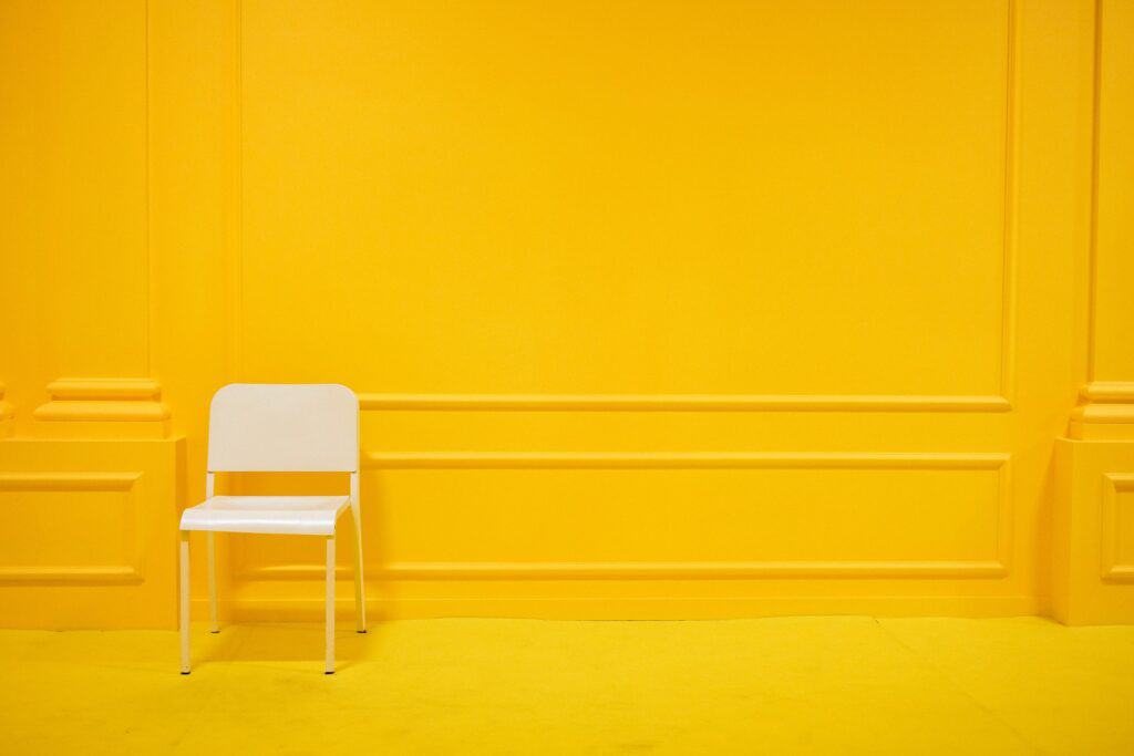
Here is my guide to the four most used interiors colours, the rooms they work in – and where they may not.
Green is Queen
Green is a favourite colour for many as it evokes feelings of nature and healing.
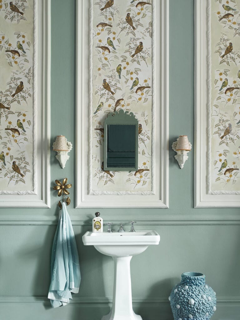
It is one of the best colours for a restful bedroom colour scheme. Lick 02 is one of the loveliest greens you’ll find for a bedroom. It offers such a calm and welcoming colour scheme that it’s a no-brainer for many people.
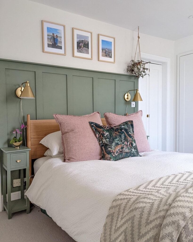
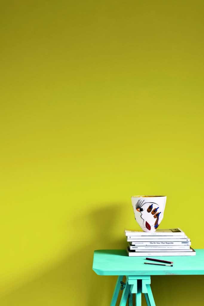
However there are greens you should not use in a bedroom. Avoid lime green as it can be overstimulating, not making for a good nights rest at all.
A lighter, fresher green is great for a home office as it keeps your mind alert but not over stimulated. Moreover, if you add some dark green plants you are introducing a lovely tonal scheme to a room without having to try too hard.
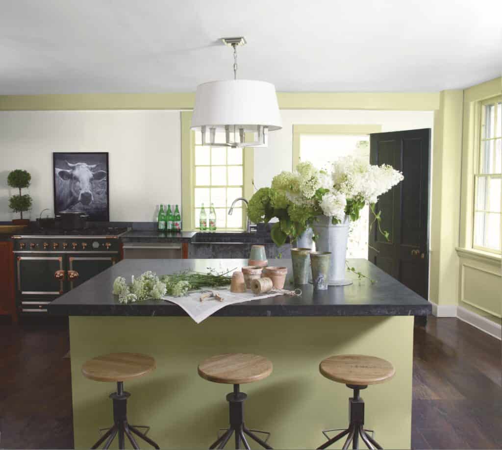
Sage, olive and khaki have been popular in kitchens recently and are a great way to promote feelings of holistic wellbeing within the heart of the home. You can either opt to paint the walls and add the colour through tiles, flooring and accessories, or go all out and choose green for your kitchen cabinets. Green kitchens are stylish and versatile as can be pared with oak, white, darker greens and pinks. These greens also look amazing with the oh-so-popular grey units and can add an injection of colour to this often cold neutral.
Blue for you?
Blue is always my go-to colour in my own interiors. I love all shades of blue from the deepest, inkiest blue to lighter cornflower purple blues and I looooove duck egg blue. Although a heads up to duck egg blue, it’s quite tricky to get right.
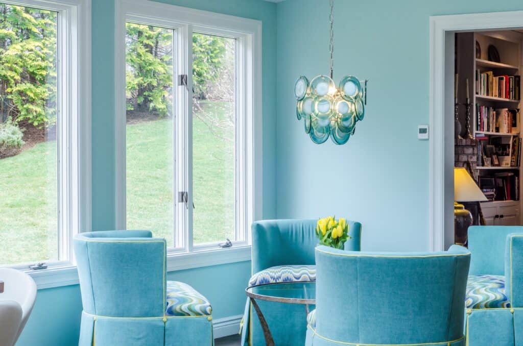
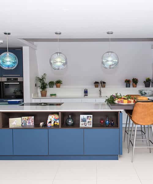
Lighter shades of blue help you to feel relaxed, so consider something like Lulworth Blue from Farrow & Ball for a low-lit bedroom. This beautiful tea room above is painted in a this slightly green blue and really adds a zing of colour to this room. I love to use darker blues with burnt orange and gold accents. Darker blue can help with concentration and although it’s meant to suppress the appetite, I personally think navy kitchen cabinetry is spot on, especially when teamed with white worktops and dark wood elements. Ahem, cue image of my own kitchen…
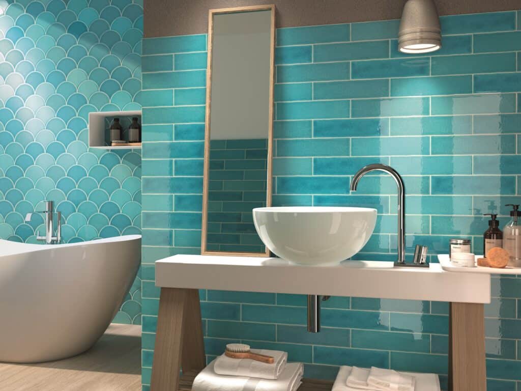
Bathrooms can be great in a zingier turquoise blue as it can help give you an energy boost. You can choose to paint walls, tile small areas or just inject a boost of colour through towels, toiletries, bath mats and accessories. Colour can be added to a room in many ways, remember it doesn’t have to be an all out makeover. By adding colour in this way you can test out if you really like it or not and try colour combinations you may not feel brave enough to try on a grander scale.
Blushing Beauties
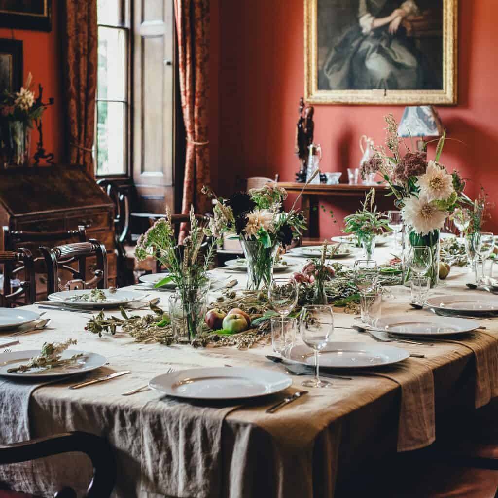
Red and Pink are colours most people think are tricky to use but consider the shades and variations and you’ll be surprised at how versatile these colours can be. A dining room painted in deep red can stimulate conversation – something like Baked Cherry from Little Greene can look stunning if paired with a dark green. This colour scheme can work for both traditional and modern settings, it’s all about making the furniture work too. Dark wood and traditional chairs for example in an older home or scheme as opposed to Scandi-style bench seating and long table for a more modern take. Soften the green slightly for the Scandi vibe and it can be vibrant and fun.
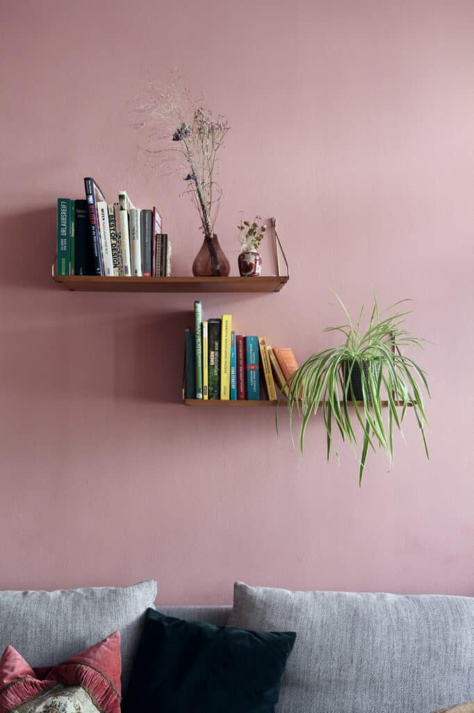
On the other end of the spectrum, consider softer blush colours for a calm bathroom design. Pink can make a room feel nurturing and relaxing, but be careful not to overdo the lighter shades, as it can feel slightly emasculating. Personally I find the dustier pinks are easier to work with and they complement the ever popular grey neutral.
Yay for Yellow
Yellow – There wasn’t a song called “Mellow Yellow” for nothing. If you get the tone right this can be the most enveloping ‘hug’ of a colour – spot on for a breakfast room or bedroom. Humpty Dumpty, shown here from Earthborn is a great example.
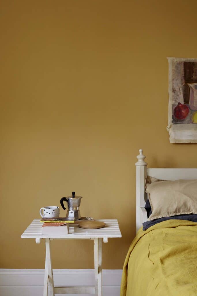
A welcoming colour, hallways work well painted in yellow – particularly if they are lacking in natural light. However, watch out for rooms that are already warm and sunny as too much yellow can, in fact, become uncomfortable. Not to mention far too bright to spend too much time in. Yellow can be over stimulating for babies too so be careful when using it for a nursery, the same for cream as it can contain quite a lot of yellow. Ideal for spaces where you want to feel optimistic, happy and a good place to start the day – so a breakfast room or kitchen.
Want more interior design tips?
Please sign up to my mailing list if you’d like more interior design tips straight in to your in box. I promise I won’t spam you, I’ll just send through great ideas, inspiring trends and the odd offer or two.
For more advice you can read my blog where I talk about the best shades for north, south, east or west facing rooms.
